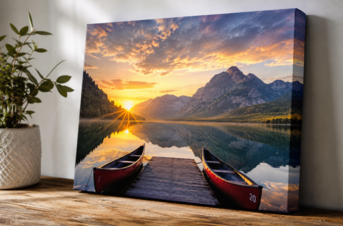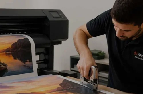
Colour calibration improves high quality photo prints by helping photographers reproduce colours more accurately between their computer screens and printed images. It reduces unexpected differences in brightness, contrast, and colour tones, ensuring that the final photograph looks closer to the original image. For photographers, artists, and businesses, colour calibration is an important step towards achieving consistent, professional printing results.
Whether you are printing portraits, landscapes, product photographs, or fine art images, a colour-managed workflow helps preserve the original creative vision.
1. Understand the Importance of Colour Calibration
Computer monitors and printers reproduce colours differently. A photograph may look bright and vibrant on a screen but appear darker, less saturated, or slightly different in colour when printed.
Colour calibration helps create a more reliable starting point by adjusting a monitor to a known colour standard. This allows photographers to make editing decisions with greater confidence before sending images for printing.
For high quality photo prints, accurate colour reproduction is especially important when preserving natural skin tones, landscape colours, and subtle details in shadows and highlights.
2. Calibrate Your Monitor Before Editing
Monitor calibration is one of the first steps in preparing photographs for professional printing. A screen with incorrect brightness or colour settings can lead to editing decisions that produce disappointing print results.
Follow these practices:
- Use a monitor calibration device when possible.
- Set a consistent screen brightness appropriate for your working environment.
- Allow your monitor to warm up before calibration.
- Avoid strong direct lighting and reflections on the display.
- Recalibrate periodically to maintain consistency.
A calibrated monitor makes it easier to judge exposure, white balance, and colour saturation accurately.
3. Use Colour Profiles for Accurate Printing
Colour profiles describe how devices reproduce colours. In a colour-managed workflow, the monitor profile helps editing software display images correctly, while the appropriate printer and paper profile helps translate image colours into printable output.
For better results:
- Use the recommended colour profile for your printer and paper combination.
- Follow your printing provider’s instructions for RGB files and embedded profiles.
- Avoid applying colour management twice, as this can create unwanted colour shifts.
- Ask your printing service for guidance when submitting files for professional output.
Using suitable colour profiles can improve consistency across different print jobs and paper types.
4. Choose Quality Paper and Compatible Inks
Paper and ink influence how colours appear in the final photograph. Glossy papers often produce vibrant colours and strong contrast, while matte papers can provide a softer appearance with reduced glare.
For artistic photographs, fine art printing offers specialised paper choices, detailed tonal reproduction, and a premium presentation. High-quality fine art papers can reveal subtle colour transitions and textures when used with compatible inks and appropriate printer profiles.
Archival pigment inks and suitable fine art papers may also support long-lasting prints when combined with proper handling, framing, and storage.
5. Soft-Proof Images Before Printing
Soft proofing allows photographers to preview how an image may look when printed using a specific printer and paper profile. This can help identify colours that the selected printing process cannot reproduce accurately.
During soft proofing, check:
- Saturated colours that may lose intensity.
- Shadow details that could become difficult to distinguish.
- Highlights that may appear too bright.
- Skin tones and other important colour areas.
Adjust your image carefully and compare the soft-proofed version with the original. A physical test print is still valuable because screen previews cannot reproduce every characteristic of paper, texture, and reflected light.
6. Work with a Professional Photo Printing Service
Professional photo printing services often use calibrated equipment and colour-managed workflows to produce consistent results. Before ordering, ask about printer profiles, paper options, proofing services, and file preparation requirements.
For large-format photographs, portfolios, and exhibition prints, reviewing a sample can help confirm that the final output meets your expectations.
Conclusion
Colour calibration improves high quality photo prints by helping maintain accurate colours, balanced tones, and consistent results throughout the printing process. Calibrating your monitor, using appropriate colour profiles, selecting compatible paper and inks, and soft-proofing images can all improve the final output.
For photographers and artists who need premium presentation, combining colour management with professional fine art printing helps produce detailed, visually consistent prints that showcase every image at its best.